Apr 29, 2013

Getting there

For the past few months, we have been challenged to come up with new, functional ways to achieve the main point of this app, which would be giving feedback on the state of the environment. We have been sketching, testing, drawing flow charts and wireframes, and finally were at the stage where we more or less agree on the visual style, interaction methods and functionalities, and can start to build our hi-fi prototype.

The process has been really challenging, educative, and sometimes even frustrating when we have seemed to get stuck on details, but hopefully in the end the result will be rewarding, as we are not settling with the obvious or given solution, but challenging the current ways of interaction for these types of rating apps: something you cannot do that often in projects where risk averse decision makers are sitting on the money.

All of us have made multiple sketches, and throughout the past few weeks, we have been emailing screens to each others, trying to create as many options as possible to choose from, as well as to communicate our design-ideas. Below are some drafts I have compiled throughout the process.

1) The rating process:
Each category is rated individually. A growing bar along with a representative smiley will indicate what kind of feelings the user associates to the place. E.g. until the half way of the circle shaped bar, the user expresses negative feelings, and from the half way up, the feelings are regarded as positive. The red arrows indicate movement.


2) The exploration process:
The idea is to cluster individual reviews to larger glyphs, which are then separated into smaller clusters and eventually into individual ratings when the user zooms the map. We were shown a great library called leaflet.js that could help us create the effect, an example can be seen for example here: http://leafletjs.com/2012/08/20/guest-post-markerclusterer-0-1-released.html


3) Visual design:
We agreed that in order for our interaction method to work, the app needs to be really simply designed and we agreed to follow flat design rules, that aim for visual clarity and simplicity. Below is my first suggestion on the visuals.


I've also tried out with little more visual smileys, like the one below, but we decided that this style is too much. The glyphs need to be kept as simple as possible as they need to work in a really small size. Also, we don't want to associate our colors with anything else than rating, so for example blue tears might introduce unintended associations.
We continue from here by defining the visual appearance of the app for our presentation, and by trying to craft a functional browser based demo using javascript, html and css, and perhaps also by employing phonegap to make the app feel more like a native app instead of a mobile website.


Apr 28, 2013

MapU testing


This spring we have continued on Rate the State of Your Local Environment project.
We have been exploring different evaluation methods and maps as well as Sara Jacobsen’s Master of Arts thesis on urban planning. Here are some map and rating examples:


As it turned out we were unable to create a working smartphone app, so we have been concentrating on the UI.
I attended a Nodebox workshop and I tried out different approaches to the user input like movement and active corners:

Here turning the phone to different positions (first row) will give different ratings as well as "hot spots" (lower row) and the rating will show as color changes on the map: bad –> unsaturated, good –> saturated + warm colors.
I created a demo with AfterEffects where shaking gives bad rating and a kiss on the phone will be good. In the movie I also added sounds: agony –> bad and baby laugh –> good.


At some point there were also experiments with fragmented maps, small game elements and Photoshop filtered maps.
After all different experiments we ended up to use facial expressions as we did in the fall and decided to rate three things: air, sound and the looks of the environment. Instead of trying to create 11 expressions we decided five expressions would be enough. The rating itself is more accurate.


The rating is based on touch and the longer the user holds down the finger, the better rating.
As in these facial studies can be seen, I had a problem with negative rating: should the starting point be indifferent (as in first face) or most negative? So I started experimenting on combining the three elements in one face. Tapping would give bad rating, holding finger down a good one. Here too the rating would happen in order: Breathe, Listen, Look.


First picture is the starting point, second the worst rating and third the best. I wanted add some more visual feedback to the map as well as to the faces.

As we decided to divide the three aspects into three faces I made new faces and tested hand movements.


I created a tiny app icon and came up with a name MapU. I made a html site and I am updating as new suggestions from other group members come forth.
The html site is at address: www.satuilta.fi/MapU/mapu.html


Apr 15, 2013

Designing for the Thumb

While playing this imaginatory game with the non existing UI I am constantly producing auditive feedback for myself. Making different “swooshs” and “clicks” helps me to go through the UI and its different functions. So, I am creating feedback ´since there is no interaction on the screen yet. More thoughts about UI sounds later...

Another thing I have noticed is that I use mainly my thumb for interacting with my smartphone. All these visualizations for gestures for iOS devices use index finger! And what is the reason for that? I use index finger only for pinch and spread actions. iPad is a different story! There are numerous studies that indicates that the use of an index finger has decreased since sms:ing started to be part of everyday communication. (I have to find this one specific study where they call people who uses thumbs as peukaloinen, thumbling).

It is interesting and inspiring to design an UI that can be used with one hand -- and more specifically an UI that is ambidextrous, so pick a hand! The app can be used also with two hands: the user holds the smartphone on the other hand and interacts with the other hand. I rarely do this my self! These were the main reasons why I started developing an UI with four active corners instead of buttons and switches.

How about you? Have you paid any attention which fingers you mainly use with your smartphone?

The Size of the Thumb

The way you hold the device is important when designing the interaction and the size of your finger defines the measurements of the UI. But how big is my thumb?

It feels like all the platforms give different measurements for these tap targets. But let´s concentrate on iOS  devices. IOS developer library offers colossal amount of information related UI design for touch screen devices. According to this source the minimum size of a tap target is 44 points, or about 1/4" or 7mm. To make this more concrete here is an example: in the iPhone keyboard the keys are 44 points tall but only 30 points wide. To fit in the full QWERTY keyboard they had to make keys more narrow -- and this is the reason why it is so annoying to write with an iPhone. You have to focus and edit your text multiple times to make it right.

Summa summarum: 44 x 44 point is the absolute minumum size for tap target but for our purposes it is too small. So, let´s make it big enough and easy to use.

The average width of an adult thumb is 1 inch (2.5 cm), which converts to 72 pixels. (http://en.wikipedia.org/wiki/Finger_%28unit%29)

About units: Pixel is the appropriate unit of measurement to use when discussing the size of a device screen or the size of an icon you create in an image-editing app. Point is the appropriate unit of measurement to use when discussing the size of an area that is drawn onscreen.

On a standard-resolution device screen, one point equals one pixel, but other resolutions might dictate a different relationship. On a Retina display, for example, one point equals two pixels.

(https://developer.apple.com/library/ios/#documentation/UserExperience/Conceptual/MobileHIG/Characteristics/Characteristics.html#//apple_ref/doc/uid/TP40006556-CH7-SW1)

 References:


Target Size Study for One-Handed Thumb Use on Small Touchscreen Devices
http://research.microsoft.com/pubs/75812/parhi-mobileHCI06.pdf

Touch key design for target selection on a mobile phone
http://arnetminer.org/publication/-495564.html


https://developer.apple.com/library/ios/#documentation/UserExperience/Conceptual/MobileHIG/Introduction/Introduction.html


UX Design Guidelines for Smartphones http://uxdesign.smashingmagazine.com/2011/10/06/not-your-parents-mobile-phone-ux-design-guidelines-smartphones/

Feb 25, 2013

The infinite space of the limited screen --- talking about the expansion of the mobile interface from space point of view


In architecture, space mainly refers to the visual level feel three-dimensional physical space. Space expansion is from a different dimension to seek solutions, including storage, hierarchical segmentation and the expansion of the perception. Analogy to the mobile experience, the most basic is how to make the limited screen carry more information and features, so users feel the space comfortable. In the app we designed, there are pieces of information shown on the result page. Therefore, I think maybe we can talk about the information design from the architectural space expansion concept in terms of information storage, hierarchical and changing faces.


Storage

Storage is to put away the infrequently used items to keep the surface neat and tidy. This way is particularly suitable for the integration of the fragmented functions.

There are 3 steps to do it.
a) Defining rules and content
Defining rules and content is to get the functions you want to show to the users straight, the key point is the label of the drawer should be really clear so that the user can find them easily whenever they want. There are many forms of the storage from the interaction behavior point of view. For instance, the most typical approach as Path sidebar style, up and down folding, sunk and so on. The purpose is to hide the infrequently used items, and there is an ever-present entrance so that when the user needs to quickly open.


b) After defining the rules and content, users can easily extend the content.
This is particularly suitable for the application of the Notepad or schedule, relatively speaking, the primary source of information for such applications is the user itself, and designers can not predict and control the order of the information. Therefore only define the rules of the storage is particularly suitable for the apps which conclude unlimited contents.


c) User can customize the content
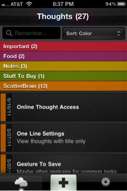
The typical example is the iPhone app interface 


2.There are two ways of storage.

a) Drawer with door
Although the drawer is closed, there should be the ever-present entrance to indicate the user where to start.

b) Drawer without door
That means there is no door for the drawer, user have to open it by gestures without having the doors.


Hierarchical information
Space is limited, so in order to use the more effective, space can be divided into sub-module to show content. Whether it is simply the list, waterfalls streams, or anything else, there will always be found from other dimensions of the remaining space. Analog to traffic, aircraft, road traffic, underground track, is to make full use of the space.
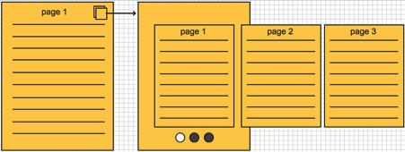
1. The multiple tab architecture


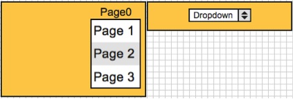
2. Lower level filter (including drop-down and floating layer style)


3. Immersive experience
Restore the camera rule “Everything looks small in the distance” that the more information can be showed by Hierarchical segmentation.


Face-changing
The small space will not be cared in the web design, the status bar is the status bar. It even can be an empty if the absence of the state. However in the mobile production design, space is considered valuable, it is also regarded as a solution to show other related content which is similar as the “if-then” construction in programming language.
1. To show different status in the same place


2. To show different functionality in the same place
As shown below, it displays the name of the contact list by default, but when the user needs to search, it will expand the search box.


Feb 20, 2013

Functional Aesthetics


Functional Aesthetics

Stephen Anderson focuses in his book Seductive Interaction Design on practical Web applications, but many of his notions on ‘curious’ insights of human behaviour are useful in other areas of design as well.
Anderson puts emphasize on good experience: “It wasn’t a focus on usability that made this a great experience. It was psychology.” (Anderson 2011, 454) He, however, makes a distinction between a good and a great experience: ease of use compared to desire to use.
While aesthetics are only one part of the user experience, they are the most frequently dicussed and misunderstood. On the one hand, we instinctively seem to know that a sense of style is important. Visual designers are constantly arguing for “good design”. On the other hand, when we get into discussions of utility and usefulness, it’s easy to marginalize these visual considerations as decoration.
So why aesthetics? For starters aesthetics include everything that appeals to senses – not just what we see, but also what we hear, smell, taste, and feel. According to Wikipedia: “aesthetics examines our response to an object or phenomenon”. How then do aesthetic design choices influence understanding and emotions, and how do understanding and emotions influence behaviour?
Cognition is the process of knowing. Based on patterns and experiences, we learn how to understand the world around us: What does this color suggest? Cognitive science studies how people know things, and aesthetics play a critical role in cognitive processing.
When talking about affect, we’re talking about feelings and emotions. Research into attention, persuasion, choice, happiness, learning, and other similar topics suggests that more attractive is likely to be more usable by most people. Neurobiologist Antonio Damasio comments on emotions: “Emotion is not a luxury: it is an expression of basic mechanisms of life regulation developed in evolution, and is indispensable for survival. It plays a critical role in virtually all aspects of learning, reasoning, and creativity. Somewhat surprisingly, it may play a role in the construction of conciousness.” (Damasio 2004)
Contrary to popular opinion, things that are enjoyable will be perceived as easy to use and efficient.
Researchers in Japan set up two ATMs that were identical in function, the number of buttons, and how they worked. The only difference was that one machine’s buttons and screens were arrenged more attractively. In both Japan and Israel (where this study was repeated to test for cultural differences), researchers observed that subjects encountered fewer difficulties with the more attractive machine. A point of clarification: if you read the original studies, you’ll see that people perceived that the attractive machine actually worked better. (Kurosu and Kashimura 1995, Noam Tractinsky 1997)
So why is this? Donald Norman in his book Emotional Design offers an explanation based on evolutionary biology and on what we know about how our brains work. Basically, when we are relaxed, our brains are more flexible and more likely to find workarounds for difficult problems. In contrast, when we’re frustrated and tense, our brains get a sort of tunnel vision where we only see the problem in front of us.
Norman offers also another explanation: we want those things that we find pleasing to succeed. We’re more tolerant of problems in things we find attractive. How many of us have tolerated faults in a person due to their attractiveness?
Other studies have also explored connections between visual aesthetics and usability, and few recent studies are finding more direct correlations between visual aesthtetics and actual performance.
Not only do aesthetics affect perceived usability, they also influence actual performance.
Recent studies on emotions are finding that we can’t actually separate cognition from affect. Separate studies in economics and in neuroscience are proving that: “affect, which is inexplicably linked to attitudes, expectations and motivations, plays a significant role in the cognition of product interaction ... the perception that affect and cognition are indipendent, separate information processing systems is flawed”. (Spillers 2004) 
At all times, we are evaluating (affect) and interpreting (cognition) the world around us.
In short, our rational choices aren’t so rational as we would like to believe.
Anderson uses the same mantra of modern architecture as Parsons and Carlson in Functional Beauty: “form follows function”. Frank Lloyd Wright changed this phrase to “form and function should be one, joined in a spiritual union,” using nature as the best example of this integration.
When thinking of aesthetics in design, it shouldn’t be the icing on the cake, but an integral part of the whole design process from the start.
Anderson adds aesthetical associations as an important part in decision making and gives as an example the design of Apple’s iPod: Why do so many people consider it as a “clean” device? Actually Jonathan Ives, Apple’s senior vice president of Design, once worked for an agency that designed bathroom appliances. What’s important is that “consciously or unconscoiusly, the iPod materials reference a convention of ‘cleanliness’ that everybody interacts with everyday – a bathroom.
These aesthetic associations are evident in other Apple products. If you own an Apple laptop, you may have noticed the soothing sleep-light indicator that’s visible when your computer is “sleeping”. The rate at which this light fades in and out is comparable to that of the average respiratory rate for adults, about 12 to 20 breaths per minute. Apple owns the patent for a Breathing Status LED Indicator, which “mimics the rhythm of breathing which is psychologically appealing”.

References

Anderson, Stephen P. 2011. Seductive Interaction Design: Creating Playful, Fun, and Effective User Experiences. Berkeley, California: New Riders. 
Damasio, Antonio 2004. Emotions and Feelings: a Neurobiological Perspective. Feelings and Emotions, The Amsterdam Symposium. 
Spillers, Frank 2004. Emotion as Cognitive Artifact and the Design Implications for Products That Are Perceived As Plearurable. Design and Emotion.

Feb 19, 2013

Responsive Design in a Nutshell

One of our forthcoming tasks is to create an application that works on multiple platforms. Our aim is to create suitable design for our app so it can be operated smoothly on laptops, pc´s, smartphones and other touch screen devices. We also have to remember the basic laws of web design and UI design. 

What is Responsive Design?

Responsive design is a web design approach aimed at crafting sites to provide an optimal viewing experience from desktop computer monitors to mobile phones.

BBC hits the age of Responsive Design.
http://thenextweb.com/dd/2013/01/13/30-new-inspiring-responsive-design-websites/2/

Elements of responsive web design

A responsive web site uses CSS3 media queries, an extension on the @media rule, to adapt the layout to the viewing environment. Plus fluid proportion-based grids and flexible images.

  • Media queries allow the page to use different CSS style rules based on the device.
  • The fluid grid concept calls for page element sizing to be in relative unites like percentages or EMs, rather than absolute units like pixels or points.
  • Flexible images are also sized in relative units (up to 100%).
Creating and updating multiple parallel web sites or apps is laborious and impractical. Responsive web design means that “website should have the technology to automatically respond to the user´s preferences”. In this case one good design is enough!

resources&inspiration: 
 
Responsive Web Design: What It is and How To Use It (Smashing Magazine)
url: http://coding.smashingmagazine.com/2011/01/12/guidelines-for-responsive-web-design/#more-75660

Design Guidelines and Tutorials
url: 
http://www.smashingmagazine.com/responsive-web-design-guidelines-tutorials/

Showcases of Responsive Web Design


http://artequalswork.com/
http://blog.teamtreehouse.com/
http://informationarchitects.net/

http://en.wikipedia.org/wiki/Responsive_web_design


Jan 24, 2013

Bechmarking

The second part of the Dynamic Visualization course started last Thursday, and our task was to do some well-structured benchmarking. We had been looking into other similar apps and services already during the fall's course, but perhaps not in such a systematic way. What we found already then was that none of the environmental apps we looked into were that engaging or well designed and that most geo-location based apps we found were pretty similar: based on google maps with some pins and additional layers.

The main points of benchmarking were to find concrete ideas we could use, and to learn from others' mistakes. Below are some of or findings regarding a few services we looked into in more detail.


What's good here:
  • First impression was very promising. The layout and Look&Feel gave a promise of good quality content and meaningful interaction. 
  • When studying the titles of the content user gets a feeling of comprehensive and versatile content. 
  • The design itself is appealing and suitable for the content
  • The design of the map is nice and clean and could work also in mobile devices. 

What we must avoid:
  • Poor and clumsy interaction
    • The map is not really dynamic part of the user interface, it is just illustration with minimum amount of functions. The map does not work as an interface.
    • The journeys are not interactive in a dynamic sense: The user can select a journey from the list and then follow the given narration. The content of the journey is still images and text. 
    • There is no visible timeline or visual cues how time passes by -- you can find some years in the text but time is not navigational element. 
  • Content and design inconsistency
    • There is no information considering the amount of content per journey -- it varies from 2 images to n images.
  • Confusing design and poor communications
    • Difficult to divide which parts of the webpage are functional (ui) and which parts are graphics. 
    • Do not promise too much -- you do not want to disappoint the users
    • How to give a general overview of the project (app, webpage) to new users --> graphics, info text, titles --> what is this service about. 

2) The urban mediator (website / demo)


What we can use
  • Closely related to our project in a way that location-based information is displayed on a map with symbols. 
  • They're using open street maps, while we're planning to use google maps. Why was open street maps chosen? Is there something we don't know that makes it more suitable?
  • They give people the option to view a list of the data, or the data on a map --> sort of similar to what we want to do.
  • Clickable symbols open a popup screen on top of the map to display photos, comments etc. --> pop-ups won't probably work in a mobile environment, but how about tablets/dekstop?
  • They have a desktop and a mobile version of it --> Should we only concentrate on mobile at this point?

What we can do better
  • Design: right now the service isn't really working, and it looks outdated (at least based on the demo)
  • Communications: when entering the urban mediator site, its hard to figure out to whom it is made for. Developers? The general public?
  • Usability: It's not that clear what you should do when entering the site. We want to make it obvious.


This is not a pretty example, but it is the first one we have found that uses gradient coloring to represent data on a map. It represents how the world's population is divided across the globe, which makes it a valid example for us: it is realistic to assume that places with the most population have the largest amount of reviews, making our gradient coloring equally unevenly distributed.

Tests for local environment

Here are some samples from early map tests for local environment with different color gradients.


Masked color gradient tests.
Some try-outs in Illustrator with gradient spots where transparency didn't really work.


The map of Finland with Illustrator's gradient spots.
Different color schemes with Google map.

From Google earth came the idea for logo with a paper cut figure inside a globe. 
This has to be rethinked, since the customer isn't quite happy with it:


Some test pictures for facial expressions:


Dec 21, 2012

All in all

I have two close friends who both are artists.

The other one is red-green color blind. He is an illustrator and before he started working with Painter program he bought colors by their names (red-something and green-something) and told me how he used to place red and green colors to the opposite sides of his watercolor palett.
He can not see the difference, only the darkness-lightness values between anything concerning these color combinations. As he told me, the way he sees these missing colors are something between brown or gray. Even so this does not affect his art:


The other artist friend of mine has a glaucoma. He is trying to paint as much as he can before he becomes blind. Glaucoma cannot be cured. He tried the medication, but it did not help so now he is facing an operation in which they try to diminsh the pressure in his eye:


About Group 1's assignments:

Visual Attention we did babdly: we just chose of the six topics two to each, and it was a bad thing since they all are related to each other. It was clearly a textbook thing and we could have got further – maybe – together.

With the other assigment Local Environment it was easier to divide who does what.
My concern was the mapping in the way the client wanted: as a blanket. The client wants two colors: green and red. I had tried all color combinations as the Global Environment group had done: from red to yellow to green with through yellow.
I knew there has to be a more simple way of doing it: there cannot be more than two colors. To keep things simple for the user: KISS-rule. So I talked the members of our group as well as the client to have the other color black. What is the good color then?

I understand the point red: alert!!! But I put black first. Yes, a negative color, but maybe we change into some other by showing a point, by making see there is as something else?

Why black is worst is because painters for some time have used to represent bad. There are examples from Soviet posters (Potjmekin) or Picasso's poster where the pigeon flies over the black guns with the green olive leave in  its mouth. These are the colors that we understand in our culture, also green is the color to which a human vision is most perceptive of.


I could of course wonder largelly of all the mathemaical equations about color, but since I'm not in to that I just wish you all

Merry Christmas and thank you all especially Markku for the great course
See you next year


Dec 17, 2012

The final presentation

Rate your environment 
our 2nd presentation

This is our 2nd also the final presentation. There is still room for improvement. Hope the current problems can be fixed in the DVD2 in spring.

Joy the app and welcome any comments!

Dec 9, 2012

Questions discussed in our presentation


At the end our our concept presentation we presented some questions that we discussed with our contact person from the ministry on Friday. After our discussion we have a pretty good view on how we are going to proceed.

The questions we presented and the answers to those are presented below.


1) How to show detailed results on the map?


How to indicate to the user what location you have chosen to view, if you cannot display information based on named areas? E.g. “Chosen location” vs. “Helsinki, Finland”
--> We won't show the user the name of the place (s)he has chosen, but will rely on their knowledge of geography. We will also display the names of major cities on the map (similar to google earth, for example).

What is the most user friendly way to move from the map view to viewing detailed results? So when will the clickable symbols appear, and from which range will reviews be displayed from?
We have been benchmarking different solutions in for example hotel booking portals and the Urban Mediator app that was recommended for us to check out. We haven't found out what the best solution would be yet, but decided to try to discuss with people who have experience in creating similar apps right when the spring's course has started, and we know what kind of resources we have during the spring.


2) Color schemes? 


Are we going to separate the expert data from common user data by using different color schemes? If so, how does the user understand the idea?
We will be using the same color schemes for both reviews, displaying them in the same view. The expert data is different from the common user's opinions essentially because this data is from country level, but it will be good to have at lest some data in the beginning, so the results section isn't completely empty, and all parts of the world have been rated at least once.


3) Logging in?


To view “my review history”, the user has to be log in. Also, (s)he has to be logged in for the ratings to appear here. At which point is the user offered the opportunity to log in?
The user will be asked to log in only when trying to access the "review history" section. This is not relevant to those users who do not want to record their own review history, but may be an interesting option for frequent users.


At this point, we have a pretty good idea on how were going to proceed next year. Only thing we need now is more information on next years course, e.g. what kind of resources and time frame we are going to have. No one of our group knows how to code, which will surely make things more difficult.

Dec 6, 2012

Concept presentation

Last week, we presented our concept to both our client on Monday, and our classmates on Thursday. What was really positive was that our contact person from the ministry of environment seemed to be very pleased with our presentation. The only major thing he wanted to change was moving from an area based thinking into location based thinking. This means, that we wouldn't give the user the chance to rate a certain city, like Helsinki, or a part of the city, like Arabia in Helsinki, but instead we should just ask him to rate his current location within a 1 km range.

This proved to be really problematic to change by our thursday's presentation, and resulted in some critique about the user friendliness of the app. I perfectly understand this critique, since we were struggling with this problem quite a bit, and it was good to hear that others had similar thoughts to ours. I was a little disappointed though that we didn't receive that much of constructive criticism, or ideas on how this could work better, but we were only told that this doesn't quite work. Which we already knew. This is also our fault, since we failed to send the presentation to our opponents in time, which was partly due to lack of information, and partly due to the changes we still had to make after discussing with the client on Monday.

So what we will have to do, is to really think about this location vs. area thing, and hopefully talk to a person with more experience on GIS systems. What makes this problem really tricky is that whichever solution we decide to go with, it should be applied consistently throughout the app, so both in the review tool, and in the results tool.

Overall, the presentation to our class gave some valuable ideas on what we will have to develop further, but I have to say that most comments were about the exactly same things we already had considered, over and over, and didn't help us get any closer to a solution. At this point, perhaps we would have needed a more in depth discussion with someone who has experience from building an app like this. The suggestion to discuss with the research group responsible for creating the urban mediator app was really helpful, and we might also contact the GIS department in Otaniemi. I met one of their professors Paula Ahonen-Rainio a few weeks ago when she was giving a guest lecture on cartography at our school, and she seemed really interested in helping us find the GIS knowledge we need to further develop this app. There apparently is a whole master's degree program dedicated to GIS systems in Otaniemi, so perhaps we could find someone from there to help us in the app development during spring, if needed. We currently have no info on the spring's course, so it's hard to plan that far ahead yet.

We will meet with the client again tomorrow. We will go through the same questions we presented in our presentation, and hopefully agree that the next step is to consult people with more expertise on our subject.

Nov 25, 2012

Why should this app exist?


As we have already explained in previous posts, our design task is to create an app for the ministry of the environment, with which the user can rate the state of his/her local environment and see the ratings from other people. What we haven’t discussed though, is why this app is important, and what kind of data were actually dealing with.

The data set

The problem in our case is, that we don’t have any pre-collected data – since we are supposed to design the data gathering method – and that the data collected will be really subjective. We want to keep the rating questionnaire as simple as possible, probably just asking “How would you rate the state of the environment in your current location (city + country, for example), but this leads to the problem of how different people define ‘environment’. After all, the environment has much more to it than just the nature. Also, we want to give users the opportunity to send a photo or a comment with their review to better explain why a place has been rated a certain way.

The users

Last Thursday, we had a concept development workshop in which we had to clearly define what our main target group and motivation for using the app is. This was really helpful, since it made us think of new viewpoints to the problem, as well as to better define our target group, which was pretty vaguely defined before the workshop.

This application will create data that can serve as a base for analyzing the environment, as well as directing resources to fixing the issues that local people find important. For this reason our ideal user would be an influencer in an organization dealing with issues related to local environment: these people can benefit from reading the users’ reviews, and can help promote the app to people interested in their environment.  We expect a majority of these people to be young adults from 25 to 35 years old. Many people in this age group also have small children, which may motivate them further to improve their environment.

Below is a summary of our thoughts regarding the users and main motivation for using the app.

User groups

- Locals wanting to make an impact on their environment
- Organizations involved in environmental issues
- Environmentally aware tourists

Ideal user

- 25–35 year-old person interested in making an impact on the state of the environment
- Influencers in local organizations involved in environmental issues
   > Users believe their opinions are heard and acted upon
   > Organizations get valuable information on where to invest resources


User motivation – why to use the app?

- To make a positive impact on the state of the local environment
   > Providing local influencers the information on which they can act upon
- To give credit for environmentally sustainable actions
   > Comparing environmental data accross the globe
- The areas performing well can be credited for their good performance
   > For fun & information


Nov 14, 2012

Addition


Small addition to Local Environment project

Local in our project means that one can zoom into some bright green or dark black – or whatever in between – point to see very local evaluations which might be really interesting. At the same time this brings some problems such as that a local community might decide to vote their small area as an environmentally perfect place. On the other hand kind this kind of behaviour may also show environmental (social) values?

Maybe also in a world map more evaluated areas could have more actively blinking points? 

Local environment


On Local Environment project

Maybe everybody remembers how Pekka from the Ministry of Environment presented our Local Environment project? To put it short, it is an application for different media and for everybody to rate their environmental surroundings where ever they are. This means that the users have to allow the media to recognise their current location which they only evaluate visually, not numerically. Furthermore there are no rules on how to measure a good or bad environment – all is based on how the users feel (mutu in Finnish). After their evaluation a point will appear on a world map. So for instance if the local environment is extremely good – whatever that may mean – the point will be bright green, and if really bad, it will be dark black. We have been talking with Pekka about the colors, whether they are green and red which would be the worst combination for color blinds. Also there are other issues in using two colors. The idea of a wireframe blanket that covers the whole world means that there is a gradiant of colors between two given points which would create quite unexpected colors to areas that have not been evaluated. Unless of course the other color is black.

Three main issues in our local environment project: 
1. An attractive user interface that everybody wants load.
2. An evaluation app of the state of the environment at the current location.  
3. A world map – preferably in 3D, works in a small screen and is attractive – that shows the evaluation data by both the experts and the users.

So far our project has following problems:
1. Until there is no evaluation, which are the colors of land and sea? Maybe no colors, just white with black contours? Would the map only show the data from experts first? How would the users’ evaluation of the environment differ from the experts’? Different color combination maybe? Or users: green-black, experts the same but with more desaturated colors?
My idea is that when starting to get data from users the contrast would grow and slowly cover experts’ data. After which the user could compare datas? How?
2. Another thing Pekka has raised is comparing data with neighbouring countries as in global environment project. I have problems in understanding how all these different aspects can be combined?

So please, if any of you have some ideas, comment.

Now we have decided not to meet with Pekka (from the Ministery) every week, but to meet when we have something more finished visuals to show him, so it would be easier to talk. So this is our aim in the near future. Also what Markku said made me think: How to make the application so attractive that somebody would really want to use it. This is my main focus now.

Nov 8, 2012

Let’s talk about Windows 8 --- Metro Start


Microsoft claim that they want to redesign the whole operating system through the Windows 8. Anyway, we can not stop her hit whatever we prefer of not.

Let me introduce some features of windows8.

“compatible PC and Tablet” “ introduced Metro UI "

Windows 8 support for tablet, while apply the design style from Windows Phone's Metro UI. The truth is a lot of interaction design is for tablet.

Three important influence on design
(1) modern design - the Bauhaus (decrease elements to show the nature)
(2) internationalism graphic design style - Swiss graphic design style (clear, true and beautiful)
(3)dynamic design - the art of film (animation to stimulate user)

People are always busy in their real life, so we need a fast, simple, direct, clear design.
Windows 8 design inspired by all kinds of navigation in subway stations, airports, etc.. People can obtain the information they want even eager to run around.


Metro UI application --- Metro start
  Metro UI is the main design style of Windows 8,especially for the Metro Start, it was in 1992 when the first "start menu" show up. Its original idea is to replace the "application management" to start the computer task. After experiencing a series of improvements, but there are still a variety of defects.

Metro Start improved Windows start menu, taskbar, notification and gadgets. It made a try as follows:
(1) expand the most commonly used area
(2) Metro Start customization
(3) larger operating space


Actually, Start has more than just a menu now. It occupies the whole screen, replacing the previous "desktop + Start menu", and carries more features. All Programs are here, the user can directly start the program here .
At the same time, it also has the following features:
(1) dynamic information: information on each block are dynamic, it presented carefully and clearly. User can customize the information, such as a city forecasts or the contents of a magazine. Get some information before you start the application.
(2) customization: the location of the blocks can easily drag and drop. User can put the most commonly used applications on the Home screen.
(3) design for touch: each block area is large enough so that it can be easily selected by finger. Each block is clicked as a whole area, not divide into the clicks region.
(4) Global view: on the touch pad, you can zoom out or zoom in your Start menu like a map, which helps you to select the application quickly.
(5) Click (not double click) to open the program.
(6) Blocks have two sizes, you can customize them. Choosing which size depends on whether the information of the application needs to be displayed. Information is not displayed on the small sized block.

I think maybe we can find some useful information from the Metro Start UI design for our app, it's like "expand the most commonly used area", "customization" or "larger operating space", or maybe for just open mind through sharing...