Feb 25, 2013

The infinite space of the limited screen --- talking about the expansion of the mobile interface from space point of view


In architecture, space mainly refers to the visual level feel three-dimensional physical space. Space expansion is from a different dimension to seek solutions, including storage, hierarchical segmentation and the expansion of the perception. Analogy to the mobile experience, the most basic is how to make the limited screen carry more information and features, so users feel the space comfortable. In the app we designed, there are pieces of information shown on the result page. Therefore, I think maybe we can talk about the information design from the architectural space expansion concept in terms of information storage, hierarchical and changing faces.


Storage

Storage is to put away the infrequently used items to keep the surface neat and tidy. This way is particularly suitable for the integration of the fragmented functions.

There are 3 steps to do it.
a) Defining rules and content
Defining rules and content is to get the functions you want to show to the users straight, the key point is the label of the drawer should be really clear so that the user can find them easily whenever they want. There are many forms of the storage from the interaction behavior point of view. For instance, the most typical approach as Path sidebar style, up and down folding, sunk and so on. The purpose is to hide the infrequently used items, and there is an ever-present entrance so that when the user needs to quickly open.


b) After defining the rules and content, users can easily extend the content.
This is particularly suitable for the application of the Notepad or schedule, relatively speaking, the primary source of information for such applications is the user itself, and designers can not predict and control the order of the information. Therefore only define the rules of the storage is particularly suitable for the apps which conclude unlimited contents.


c) User can customize the content
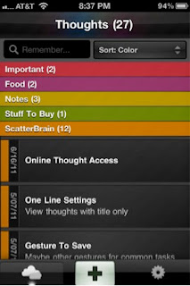
The typical example is the iPhone app interface 


2.There are two ways of storage.

a) Drawer with door
Although the drawer is closed, there should be the ever-present entrance to indicate the user where to start.

b) Drawer without door
That means there is no door for the drawer, user have to open it by gestures without having the doors.


Hierarchical information
Space is limited, so in order to use the more effective, space can be divided into sub-module to show content. Whether it is simply the list, waterfalls streams, or anything else, there will always be found from other dimensions of the remaining space. Analog to traffic, aircraft, road traffic, underground track, is to make full use of the space.
1. The multiple tab architecture


2. Lower level filter (including drop-down and floating layer style)


3. Immersive experience
Restore the camera rule “Everything looks small in the distance” that the more information can be showed by Hierarchical segmentation.


Face-changing
The small space will not be cared in the web design, the status bar is the status bar. It even can be an empty if the absence of the state. However in the mobile production design, space is considered valuable, it is also regarded as a solution to show other related content which is similar as the “if-then” construction in programming language.
1. To show different status in the same place


2. To show different functionality in the same place
As shown below, it displays the name of the contact list by default, but when the user needs to search, it will expand the search box.


Feb 20, 2013

Functional Aesthetics


Functional Aesthetics

Stephen Anderson focuses in his book Seductive Interaction Design on practical Web applications, but many of his notions on ‘curious’ insights of human behaviour are useful in other areas of design as well.
Anderson puts emphasize on good experience: “It wasn’t a focus on usability that made this a great experience. It was psychology.” (Anderson 2011, 454) He, however, makes a distinction between a good and a great experience: ease of use compared to desire to use.
While aesthetics are only one part of the user experience, they are the most frequently dicussed and misunderstood. On the one hand, we instinctively seem to know that a sense of style is important. Visual designers are constantly arguing for “good design”. On the other hand, when we get into discussions of utility and usefulness, it’s easy to marginalize these visual considerations as decoration.
So why aesthetics? For starters aesthetics include everything that appeals to senses – not just what we see, but also what we hear, smell, taste, and feel. According to Wikipedia: “aesthetics examines our response to an object or phenomenon”. How then do aesthetic design choices influence understanding and emotions, and how do understanding and emotions influence behaviour?
Cognition is the process of knowing. Based on patterns and experiences, we learn how to understand the world around us: What does this color suggest? Cognitive science studies how people know things, and aesthetics play a critical role in cognitive processing.
When talking about affect, we’re talking about feelings and emotions. Research into attention, persuasion, choice, happiness, learning, and other similar topics suggests that more attractive is likely to be more usable by most people. Neurobiologist Antonio Damasio comments on emotions: “Emotion is not a luxury: it is an expression of basic mechanisms of life regulation developed in evolution, and is indispensable for survival. It plays a critical role in virtually all aspects of learning, reasoning, and creativity. Somewhat surprisingly, it may play a role in the construction of conciousness.” (Damasio 2004)
Contrary to popular opinion, things that are enjoyable will be perceived as easy to use and efficient.
Researchers in Japan set up two ATMs that were identical in function, the number of buttons, and how they worked. The only difference was that one machine’s buttons and screens were arrenged more attractively. In both Japan and Israel (where this study was repeated to test for cultural differences), researchers observed that subjects encountered fewer difficulties with the more attractive machine. A point of clarification: if you read the original studies, you’ll see that people perceived that the attractive machine actually worked better. (Kurosu and Kashimura 1995, Noam Tractinsky 1997)
So why is this? Donald Norman in his book Emotional Design offers an explanation based on evolutionary biology and on what we know about how our brains work. Basically, when we are relaxed, our brains are more flexible and more likely to find workarounds for difficult problems. In contrast, when we’re frustrated and tense, our brains get a sort of tunnel vision where we only see the problem in front of us.
Norman offers also another explanation: we want those things that we find pleasing to succeed. We’re more tolerant of problems in things we find attractive. How many of us have tolerated faults in a person due to their attractiveness?
Other studies have also explored connections between visual aesthetics and usability, and few recent studies are finding more direct correlations between visual aesthtetics and actual performance.
Not only do aesthetics affect perceived usability, they also influence actual performance.
Recent studies on emotions are finding that we can’t actually separate cognition from affect. Separate studies in economics and in neuroscience are proving that: “affect, which is inexplicably linked to attitudes, expectations and motivations, plays a significant role in the cognition of product interaction ... the perception that affect and cognition are indipendent, separate information processing systems is flawed”. (Spillers 2004) 
At all times, we are evaluating (affect) and interpreting (cognition) the world around us.
In short, our rational choices aren’t so rational as we would like to believe.
Anderson uses the same mantra of modern architecture as Parsons and Carlson in Functional Beauty: “form follows function”. Frank Lloyd Wright changed this phrase to “form and function should be one, joined in a spiritual union,” using nature as the best example of this integration.
When thinking of aesthetics in design, it shouldn’t be the icing on the cake, but an integral part of the whole design process from the start.
Anderson adds aesthetical associations as an important part in decision making and gives as an example the design of Apple’s iPod: Why do so many people consider it as a “clean” device? Actually Jonathan Ives, Apple’s senior vice president of Design, once worked for an agency that designed bathroom appliances. What’s important is that “consciously or unconscoiusly, the iPod materials reference a convention of ‘cleanliness’ that everybody interacts with everyday – a bathroom.
These aesthetic associations are evident in other Apple products. If you own an Apple laptop, you may have noticed the soothing sleep-light indicator that’s visible when your computer is “sleeping”. The rate at which this light fades in and out is comparable to that of the average respiratory rate for adults, about 12 to 20 breaths per minute. Apple owns the patent for a Breathing Status LED Indicator, which “mimics the rhythm of breathing which is psychologically appealing”.

References

Anderson, Stephen P. 2011. Seductive Interaction Design: Creating Playful, Fun, and Effective User Experiences. Berkeley, California: New Riders. 
Damasio, Antonio 2004. Emotions and Feelings: a Neurobiological Perspective. Feelings and Emotions, The Amsterdam Symposium. 
Spillers, Frank 2004. Emotion as Cognitive Artifact and the Design Implications for Products That Are Perceived As Plearurable. Design and Emotion.

Feb 19, 2013

Responsive Design in a Nutshell

One of our forthcoming tasks is to create an application that works on multiple platforms. Our aim is to create suitable design for our app so it can be operated smoothly on laptops, pc´s, smartphones and other touch screen devices. We also have to remember the basic laws of web design and UI design. 

What is Responsive Design?

Responsive design is a web design approach aimed at crafting sites to provide an optimal viewing experience from desktop computer monitors to mobile phones.

BBC hits the age of Responsive Design.
http://thenextweb.com/dd/2013/01/13/30-new-inspiring-responsive-design-websites/2/

Elements of responsive web design

A responsive web site uses CSS3 media queries, an extension on the @media rule, to adapt the layout to the viewing environment. Plus fluid proportion-based grids and flexible images.

  • Media queries allow the page to use different CSS style rules based on the device.
  • The fluid grid concept calls for page element sizing to be in relative unites like percentages or EMs, rather than absolute units like pixels or points.
  • Flexible images are also sized in relative units (up to 100%).
Creating and updating multiple parallel web sites or apps is laborious and impractical. Responsive web design means that “website should have the technology to automatically respond to the user´s preferences”. In this case one good design is enough!

resources&inspiration: 
 
Responsive Web Design: What It is and How To Use It (Smashing Magazine)
url: http://coding.smashingmagazine.com/2011/01/12/guidelines-for-responsive-web-design/#more-75660

Design Guidelines and Tutorials
url: 
http://www.smashingmagazine.com/responsive-web-design-guidelines-tutorials/

Showcases of Responsive Web Design


http://artequalswork.com/
http://blog.teamtreehouse.com/
http://informationarchitects.net/

http://en.wikipedia.org/wiki/Responsive_web_design